

Total return and annualized return tell you what happened. Time-weighted return tells you how the strategy actually performed independent of your cash flows. Sharpe ratio tells you whether the returns you got were worth the volatility you sat through. Max drawdown tells you the worst pain you would have felt holding on. Performance attribution tells you why. Skip any of these five, and you're evaluating a portfolio half blind. Calculation method and benchmark choice determine whether any of these numbers can be compared across time or against a peer at all.
TL;DR:
- Time-weighted returns are essential for assessing a manager’s skill, as they neutralize cash flow timing and are required by industry standards like GIPS.
- Risk-adjusted ratios such as Sharpe, Sortino, Treynor, and Jensen's alpha must be interpreted in context, considering the portfolio's time frame and specific risk assumptions.
- Maximum drawdown and liquidity measures are more relevant than volatility alone, as they directly relate to investor panic points and exit risks.
- Diversification metrics like correlation and diversification ratio help identify hidden concentration risks that may amplify during market stress.
- Data quality issues, such as stale pricing, corporate actions, and limited lookback periods, can distort performance metrics and must be carefully managed.
Table of Contents
- Core Portfolio Analytics Metrics for Returns
- Risk-Adjusted Ratios: Sharpe, Sortino, Treynor, and Jensen's Alpha
- Risk Measures That Go Beyond a Single Ratio
- Performance Attribution: Finding the Drivers of Return
- Benchmarking, Composites, and GIPS-Conformant Reporting
- How StockPilot Applies These Metrics in Practice
- Liquidity Metrics You Can't Skip
- Style and Factor Exposure Analysis
- Correlation and Diversification Metrics
- Data Quality and Its Limits in Portfolio Analytics
- A Practical Cadence for Monitoring Your Metrics
- Where to Verify These Formulas and Standards
- Sources
Core Portfolio Analytics Metrics for Returns
Total return is the simplest number in portfolio analytics: ending value minus beginning value, plus income, divided by beginning value. Annualized return converts a multi-year total return into a single yearly figure using geometric compounding, so a 33% gain over three years becomes roughly 10% annualized, not 11%. That distinction gets confused constantly, and it skews how people compare a fund's three-year record to its five-year record.
Where things get genuinely technical is in how you handle cash flows. Two return calculation methods dominate professional reporting:
- Time-weighted return (TWR) breaks the period into sub-periods around each cash flow, calculates a return for each, and geometrically links them. This neutralizes the effect of when you deposited or withdrew money, which is exactly why it's the standard for judging a manager's skill.
- Money-weighted return (MWR), essentially an internal rate of return (IRR), does the opposite: it's highly sensitive to the timing and size of your contributions and withdrawals, which makes it the right tool for understanding your actual realized experience as an investor, not the manager's skill.
The Global Investment Performance Standards (GIPS) require firms to use time-weighted returns adjusted for external cash flows and to report total return inclusive of income, plus realized and unrealized gains. Firms without daily valuation capability often use the Modified Dietz method, which weights each cash flow by the fraction of the period it was invested. It's an approximation, but a good one when true daily valuation isn't available.
Three habits separate clean reporting from misleading reporting: always include dividend and interest income in total return, deduct actual trading costs rather than estimates, and use trade-date accounting (recording a trade when executed, not when it settles) so your numbers line up with everyone else's. GIPS specifically recommends valuing portfolios on the date of any large external cash flow to avoid distorting the return calculation.
Risk-Adjusted Ratios: Sharpe, Sortino, Treynor, and Jensen's Alpha
A portfolio that returned 12% while its benchmark returned 9% isn't automatically the better investment. It depends entirely on how much risk was taken to get there, which is what risk-adjusted ratios exist to answer.
- Sharpe ratio divides excess return (portfolio return minus the risk-free rate) by standard deviation, the portfolio's total volatility. It's the most widely cited risk-adjusted metric, but it penalizes upside volatility the same way it penalizes downside volatility, which distorts the picture for strategies with lumpy, positively skewed returns.
- Sortino ratio fixes that blind spot by dividing excess return by downside deviation only. A concentrated growth portfolio with occasional big up months but a smooth downside will often show a Sortino ratio noticeably better than its Sharpe ratio.
- Treynor ratio swaps standard deviation for beta, measuring reward per unit of systematic (market) risk. It's the more honest metric for a well-diversified portfolio where idiosyncratic risk has mostly been diversified away.
- Jensen's alpha measures the return above what the Capital Asset Pricing Model (CAPM) predicted given the portfolio's beta. It's the cleanest answer to the alpha vs beta investing question: beta tells you how much market exposure you're carrying, alpha tells you what the manager added on top of that exposure.
Pro Tip: Never read a Sharpe or Sortino ratio in isolation. A 1.2 Sharpe ratio over a bull-market lookback period means something completely different from a 1.2 Sharpe ratio measured through a full market cycle that includes a drawdown. Sharpe, Treynor, and Jensen each rest on a different risk assumption, and each is appropriate for a different portfolio context. A short lookback window, illiquid holdings that get stale-priced, and leverage all distort every ratio on this list, sometimes badly.
Risk Measures That Go Beyond a Single Ratio
Standard deviation measures how much a portfolio's returns bounce around its own average. It's useful, but it treats a sharp upward spike the same as a sharp drop, which is precisely why standard deviation alone undersells downside risk.
Beta measures sensitivity to a benchmark; correlation measures how closely two assets move together. Both matter for diversification, because a portfolio full of high-correlation holdings isn't actually diversified even if it holds forty different tickers.
- Maximum drawdown captures the largest peak-to-trough decline over a period, and time underwater measures how long it took to recover. These two numbers matter more to real investors than any volatility statistic, because drawdown is what actually triggers panic selling.
- Value at Risk (VaR) estimates the maximum expected loss over a given time horizon at a given confidence level (commonly 95% or 99%).
- Conditional VaR (CVaR), also called expected shortfall, estimates the average loss in the scenarios that fall beyond the VaR threshold, which matters because VaR itself says nothing about how bad the tail outcomes get.
- Stress testing and scenario analysis apply concrete historical or hypothetical shocks (a 2008-style credit freeze, a rate spike, an oil shock) to see how a current portfolio would have behaved.
Portfolio-analysis platforms increasingly bundle these features together, offering stress testing and side-by-side scenario comparison so an investor can see the effect of a named shock rather than an abstract volatility number. That kind of concrete scenario is also one of the more persuasive ways to explain risk to a client who tunes out at the mention of standard deviation.
Performance Attribution: Finding the Drivers of Return
Attribution analysis breaks total portfolio return into three components: allocation effect (did you overweight the sectors or asset classes that outperformed?), selection effect (did the specific securities you picked within each sector beat their sector benchmark?), and interaction effect (the combined result of allocation and selection decisions working together, or against each other).
Reading attribution well means handling mixed signals correctly:
- Positive selection, negative allocation usually means the manager picks good stocks but gets sector weighting wrong, a common pattern worth flagging in manager reviews.
- Positive allocation, negative selection suggests a macro call worked but execution within that call lagged, which is a different conversation with a different manager entirely.
- Negative on both is the clearest signal to consider a replacement or a structural change in approach.
Tools that let you drill down to see which individual holdings are driving portfolio-level metrics, showing Max Drawdown, Sortino, Sharpe, alpha, and beta side by side, make this kind of diagnosis far faster than reconstructing it by hand. Attribution is also what turns quarterly client reporting from a return number into an actual explanation.
Benchmarking, Composites, and GIPS-Conformant Reporting
A Sharpe ratio of 1.1 means nothing without knowing what you're comparing it against. Benchmark selection has to match the strategy's asset class, liquidity profile, and currency exposure, or the comparison is misleading from the start; this is why understanding why Australian-only + vertical-deep is the fit for portfolio construction can deeply influence how metrics are interpreted. A small-cap value manager measured against the S&P 500 will look either brilliant or terrible depending on the cycle, for reasons that have nothing to do with skill.
For firms managing multiple similar accounts, GIPS lays out specific composite rules:
- Report total return, meaning income plus realized and unrealized gains and losses, never price return alone.
- Use time-weighted returns adjusted for external cash flows, so no single client's deposit timing skews the composite.
- Asset-weight (not simple-average) each account's return into the composite figure.
- Value the portfolio at consistent, sufficiently frequent intervals, and specifically on dates of large external cash flows.
GIPS guidance pushed many firms toward monthly valuation and daily cash-flow weighting as the standard for accuracy, replacing coarser quarterly approximations. A useful checklist before publishing any performance statement: confirm the benchmark matches the strategy, confirm returns are time-weighted and cash-flow adjusted, confirm income is included, and confirm the composite is asset-weighted rather than simply averaged.
How StockPilot Applies These Metrics in Practice
A model portfolio can be run that continuously evaluates market, fundamental, technical, sentiment, and statistical data, rather than issuing speculative picks. When conditions turn unfavorable, a system may reduce growth exposure and shift capital toward Treasury ETFs as part of a built-in risk-management process, echoing the drawdown-control logic behind stress testing and maximum drawdown analysis.
Subscribers can see analytics such as return figures, drawdown behavior, and Sharpe-style risk-adjusted indicators that show whether a portfolio's gains come with an acceptable amount of volatility. Buy and sell alerts can be sent after hours, only when predefined criteria call for a change, not on a hunch or headline. Trades typically run through the investor's own brokerage account, so investors keep control while underlying metrics do the monitoring work in the background.
Liquidity Metrics You Can't Skip
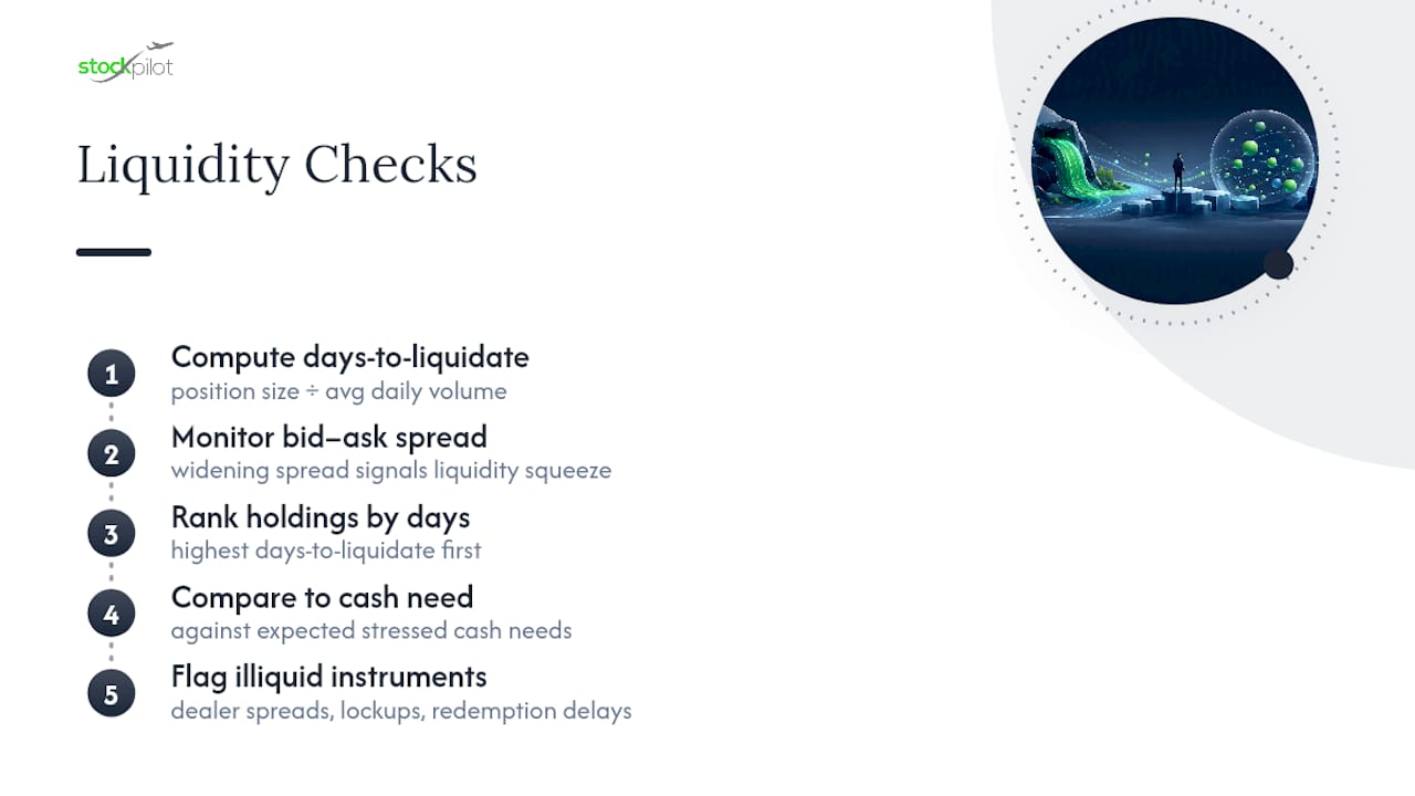
A portfolio can show a strong Sharpe ratio and still blow up if you can't exit positions when you need to. Liquidity analysis measures how quickly a holding can convert to cash without moving its price against you, and it deserves its own line item, separate from return and volatility metrics.
Average daily trading volume relative to your position size is the starting point. If your position represents several days of typical trading volume, you have a liquidity problem that won't show up in any standard deviation calculation. Bid-ask spread is the second signal: a widening spread on a holding often precedes a broader liquidity squeeze, well before the price itself drops.
For fixed income and alternative holdings, liquidity gets more complicated. Bonds trade over the counter with wide dealer spreads that vary by issue size and credit quality. Private funds and certain structured products may lock up capital for months or years, meaning a headline return figure hides the fact that you couldn't have exited at that price on demand.
A practical liquidity check: rank every holding by days-to-liquidate at a reasonable percentage of daily volume, then compare that ranking against how much of the portfolio you might need to raise in a stressed market. Portfolios that look diversified on a correlation matrix can still be dangerously concentrated in illiquid names when a redemption or margin call actually arrives.
Style and Factor Exposure Analysis
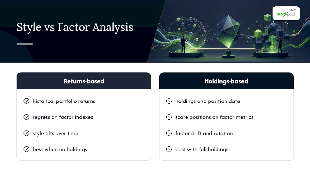
Two portfolios with identical Sharpe ratios can carry completely different risk if one is loaded with momentum and small-cap exposure while the other sits in large-cap quality names. Style analysis identifies these tilts, typically decomposing returns against recognized factors: value versus growth, market capitalization, momentum, quality, and low volatility.
Factor exposure matters because it explains performance that a simple benchmark comparison misses. A portfolio that beat the S&P 500 last year might have done so purely because it carried heavy momentum exposure during a momentum-favorable stretch, not because of genuine security selection skill. Returns-based style analysis, which regresses a portfolio's historical returns against factor indexes, is the standard diagnostic here, and it works even when you don't have full holdings-level transparency.
Holdings-based factor analysis goes a level deeper, scoring each individual position on valuation multiples, growth rates, and momentum characteristics, then aggregating those scores to the portfolio level. This approach catches factor drift that returns-based analysis can miss, especially in portfolios that have rotated sector exposure without changing their overall market beta.
The practical use case: if a portfolio's factor exposure has drifted heavily toward one style since the last review, that drift itself is information, whether or not the manager intended it. Unintended factor bets are one of the more common ways portfolios quietly take on risk nobody signed off on.
Correlation and Diversification Metrics
Diversification only works when the assets inside a portfolio don't move together, and correlation coefficients are the number that tells you whether that's actually true. A correlation of 1.0 means two assets move in lockstep; a correlation near 0 means their movements are unrelated; negative correlation means they tend to move in opposite directions, which is the real diversification benefit investors are usually chasing.
The trap is that correlations aren't stable. Assets that show low correlation during calm markets often converge toward 1.0 during a crisis, exactly when diversification matters most. That's why a full correlation matrix run only on trailing bull-market data can flatter a portfolio's diversification profile far more than its behavior during a real stress event would justify.
A correlation matrix across all major holdings surfaces clusters that a simple sector breakdown misses, since two holdings in different sectors can still carry high correlation if they share the same macro sensitivity, interest rates, for instance, or commodity prices. Diversification ratio, a single number comparing a portfolio's actual volatility to the weighted-average volatility of its individual components, gives a quick read on how much real diversification benefit the mix is delivering versus simply owning more names.
Data Quality and Its Limits in Portfolio Analytics
Every metric in this article is only as good as the data feeding it, and that data has real limitations worth naming directly. Stale pricing on illiquid or infrequently traded holdings can make volatility and correlation figures look artificially low, understating true risk. Survivorship bias in benchmark and peer-group data inflates historical comparisons when funds that closed or merged simply drop out of the record.
Corporate actions, splits, spinoffs, mergers, special dividends, need consistent handling or they'll create phantom return spikes or drops that have nothing to do with actual performance. Currency conversion timing matters for international holdings; using an end-of-day rate versus a trade-time rate can shift reported returns by a meaningful margin over a full year.
Short lookback periods are the most common data quality problem in practice. A Sharpe ratio calculated over eighteen months of a strong bull run tells you almost nothing about how that same portfolio would behave in a drawdown, yet it's routinely presented as if it does. The Investopedia guidance on risk-adjusted ratios is explicit that lookback period and benchmark choice determine whether a single ratio has any real context. Before trusting any dashboard number, ask what period it covers, how gaps and corporate actions were handled, and whether the benchmark actually matches the strategy being measured.
A Practical Cadence for Monitoring Your Metrics
Check total return and drawdown monthly. Review Sharpe or Sortino ratio, attribution, and factor drift quarterly. Do a full annual reconciliation of fees, cash flows, and benchmark fit, matching FINRA's recommendation for regular, not constant, performance review. A rough rule of thumb: investigate any drawdown exceeding 15% or a Sharpe ratio drop of more than 30% quarter over quarter.
— David Elliot
Where to Verify These Formulas and Standards
For the calculation rules behind time-weighted returns and composite reporting, consult the GIPS calculation methodology directly. FINRA's evaluating performance guide and Investopedia's performance measurement primer cover the underlying formulas in more depth, while diagnostic tools like PortfoliosLab let you test drawdown and ratio calculations against your own holdings.
If you'd rather have these metrics tracked and interpreted for you, StockPilot's AI-powered portfolio system applies this same analytical framework to a transparent, 19-position model portfolio, issuing after-hours alerts only when its risk criteria call for a change. You can review the risk disclosure for details on how that risk management process works, or join the waitlist for early access and subscriber offers.
This article is general information, not a substitute for advice from a qualified financial advisor. Consult a qualified financial professional about your own circumstances before acting on anything here.
Sources
- GIPS® Guidance Statement on Calculation Methodology
- Measuring a Portfolio's Performance — Investopedia
- Evaluating performance — FINRA
- Portfolio Analysis Tool - Vanguard (advisors)